A picture is worth a thousand words.
Check out our work samples we've previously done.


Since 2015, we have been collaborating with FreshAndWipe in building its brand image. We helped FreshAndWipe to further define its targeted audience by providing a carefully crafted brand style guide that represents what FreshAndWipe stands for.
Phase 1 - Design Concepts
Here, we explored possible design options and brand colors that speak for the brand.

*Exploring possibilities by considering application and perceived value across all company materials.
Phase 2 - Refining Winning Design Concept
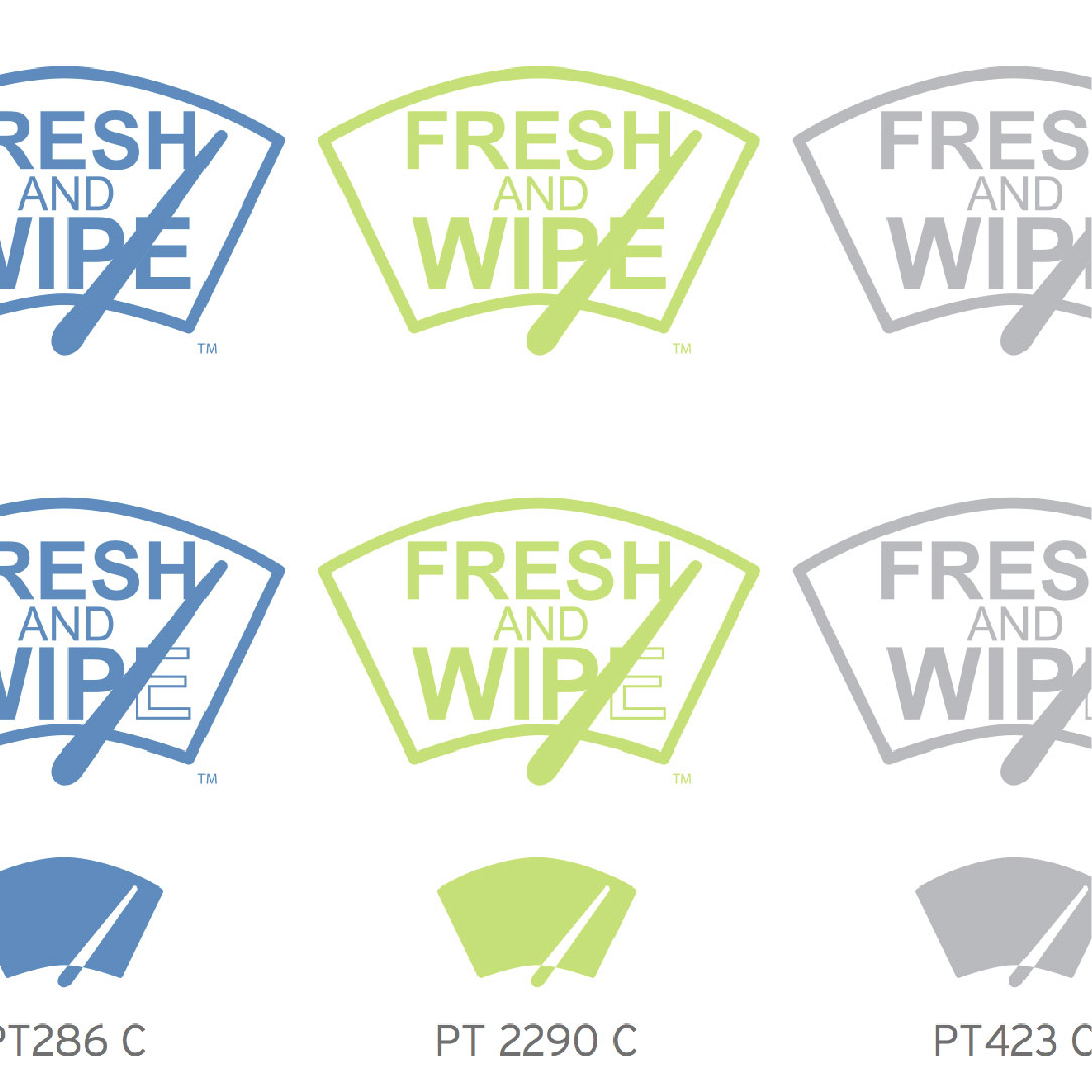
Here, we definied 3 company colors, played around with color combinations against 3 shades of background colors.

*Exploring possibilities by considering application and perceived value across all company materials.
Phase 3 - Applying Company Colors
At this point, we began to apply the company colors across all company assets, tieing the brand together with cohesion that speaks on its own.


Packaging is another key part of branding. You may click here to see how the brand image translated onto packaging designs.
We had the opportunity to work with Fresh Riviera on rebranding their company logo and a couple of fashion items to be sold at their online and retail stores. The design process we took on the rebranding started with Discovery and 4 phases.
Discovery
We took the time to understand Fresh Riviera’s target audience, the reasons behind this rebrand project, and future goals it plans to achieve with the new branding. We compiled market research and presented design ideas in 4 phases.

* The original logo provided by Fresh Riviera.
Phase 1 - Design Concepts
Here, we explored various design options, introduced additional brand colors, and typography that speak for the brand.

Phase 2 - Refining Winning Design Concept
Here, we gathered feedback on each and every design option we have provided. At first, Fresh Riviera wasn’t quite sure about the drastic change, they were concern that the new look may not be recognizable. We discussed our intended approach and vision for the new look. We then finalized the phase with a chosen direction along with a few rounds of edits.

* Based on the feedback we gathered, we executed this round of edit with a refined icon, custom typography, and added a tagline.
Phase 3 - Edits and Revision
Fresh Riviera wanted to see an alternative design idea by combining the original icon into the new design. In this phase, with the consideration of social media usage, we started to design the overall layout of the logo. We played with possible composition options. In addition, we provided valued analytical feedback to Fresh Riviera on our overall approach. Fresh Riviera reconsidered this phase’s design.

* Fresh Riviera reconsidered this phase’s design after hearing our valued analytical feedback.
Phase 4 - Final Deliverable
At the end, Fresh Riviera decided to proceed with the initial icon in 2 different solid color directioins. We also refined the typography to better blend in with the icon.

* Final design
In addition to building the Fresh Riviera brand, they had a plan to expand their retail product line. With the given design background and expertise, we were asked to present 2 signature print pattern designs for leggings to be printed on demand.
Discovery
Now that we had a great idea what Fresh Riviera was about, we were able to quickly define the appropriate trend and design concepts that would be suitable for the brand. We compiled trend research and presented design ideas in 3 phases.

* From the trend forecasting research, we identified 2 different design concepts.
Phase 1 - Design Concepts
Here, we put together and presented 2 design options as our first drafts. The feedback was well received with very minor changes to the designs.

Phase 2 - Edit and Revision
It helped to have positive feedback in our initial drafts in phase one. All that was needed to change was a few very minor element changes. Other than that, Fresh Riviera decided to take these designs into production.

Phase 3 - Production
Using the template provided by the on demand printing vendor, we laid out the production artwork for submission. Here we had to consider the overall print quality when we went into optimizing the finalized digital print designs.

Final Product
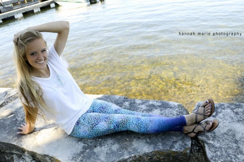
Fresh Riviera had a photoshoot session with a model wearing one of the designs. It is now selling at their online shop.

Since 2015, we have been collaborating with FreshAndWipe in building its brand image. One of the many services we provided was packaging.
Overview
As we develop the first packaging layout, we looked into the market for ideas, in specifically the auto accessories category. As we gathered feedback from industry leaders, we continued to refined the packaging in 2016 by adding a few elements on the design layout.
In 2017, we redesigned the layout to test the market acceptances.

* We continued to further improve FreshAndWipe's brand image by testing with a variation of packaging looks.
2017
As the brand continues to grow, the brand begain to enter into retail spaces such as car wash stations and auto body shops. In an effort to provide more options to the target market, the brand added a lower tiered product within the product line - paper air freshener.
Retail Counter PDQ Display
A PDQ display is a point-of-sale tray, bin or rack that is lightweight and easy to install in retail stores.
We applied and translated the new brand image onto the packaging for this new product, along with a PDQ display.


Throughout the year, the company attended trade shows to expand its market reach. We had designed and developed countless amount of sales and marketing materials to help support the brand presense at the show.
Below are branded show booth materials, equipments and vehicle wrap design we generated for FreshAndWipe.

Easter Interactive Gift Box
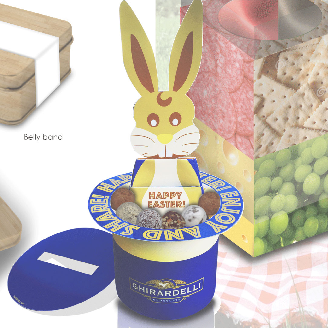
To promote Easter, we designed an interactive gift box to store and share the signature Ghirardelli truffles. The idea behind was to create a playful experience while enjoying the delicious chocolate pieces among family and friends.
Phase 1 - Sketches
Our initial inspiration was a 3D greeting box. We brainstormed possible product packaging ideas with the concept of an expandable box.

Phase 2 - Refine Concept
We chose a direction and further refined the concept into an interactive gift box for Ghirardelli to adapt into their Easter promotion campagin.

Phase 3 - Dieline
Part of turning the idea into a reality was drafting the dieline. In this phase, we carefully spec out each and every component of the box. We digitally illustrated the parts and applied surface designs with the brand image of Ghirardelli.

Phase 4 - Prototype
Putting together the parts into a 3D prototype. During this process, we further refined the dieline to enable perfect assembly.

Web Designed by Stephanie Ip and Developed by Bryan Jue
Copyright © 2019 SIP by Stephanie Ip. All rights reserved

